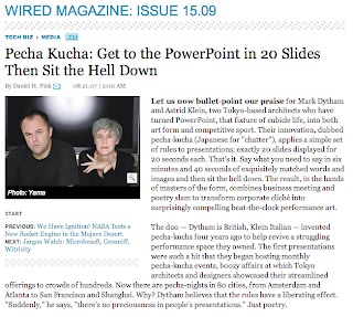
You can use fewer words, better pictures, tweak the transitions all you want, but until you think of it differently from the start... you might just have a less bad PowerPoint screen. Use it fundamentally in a different way, and keep the focus on your overall presentation and YOUR thoughts. You know, where it should be anyway?

Check out the article and the author's demonstration of the technique. Mighty compelling way to set up a room.
